Building a Dynamic Stock Chart with Dash
The project described below was part of the Interactive Python Dashboards with Plotly and Dash course available on Udemy.
Background
I have a fair amount of experience building out dashboards with platforms such as Tableau, DOMO and Adobe Analytics (for web data). These platforms already come with a suite of tools to link data sources, contain data in a format appropriate for analysis (like a relational database/CSV) and provide reader-friendly visualizations.
These platforms have a couple of issues:
- They have expensive recurring subscription costs
- Their ease of use comes at the cost of decreased flexibility. If the tool doesn’t allow you to display information in a certain way, you’re either stuck or have to apply a patch work solution.
Enter Dash, a Python framework for data visualization apps provided by Plotly (the company that created the eponymous data visualization library). It can create really flexible dashboards and data can be acquired/wrangled using any library available in Python.
Dash uses a combination of Plotly, React (a Javascript library for UI) and Flask (a web app framework). You can certainly learn as you go, but it helps to have some experience with data visualization in Python and web app deployment/design to implement Dash apps.
Task
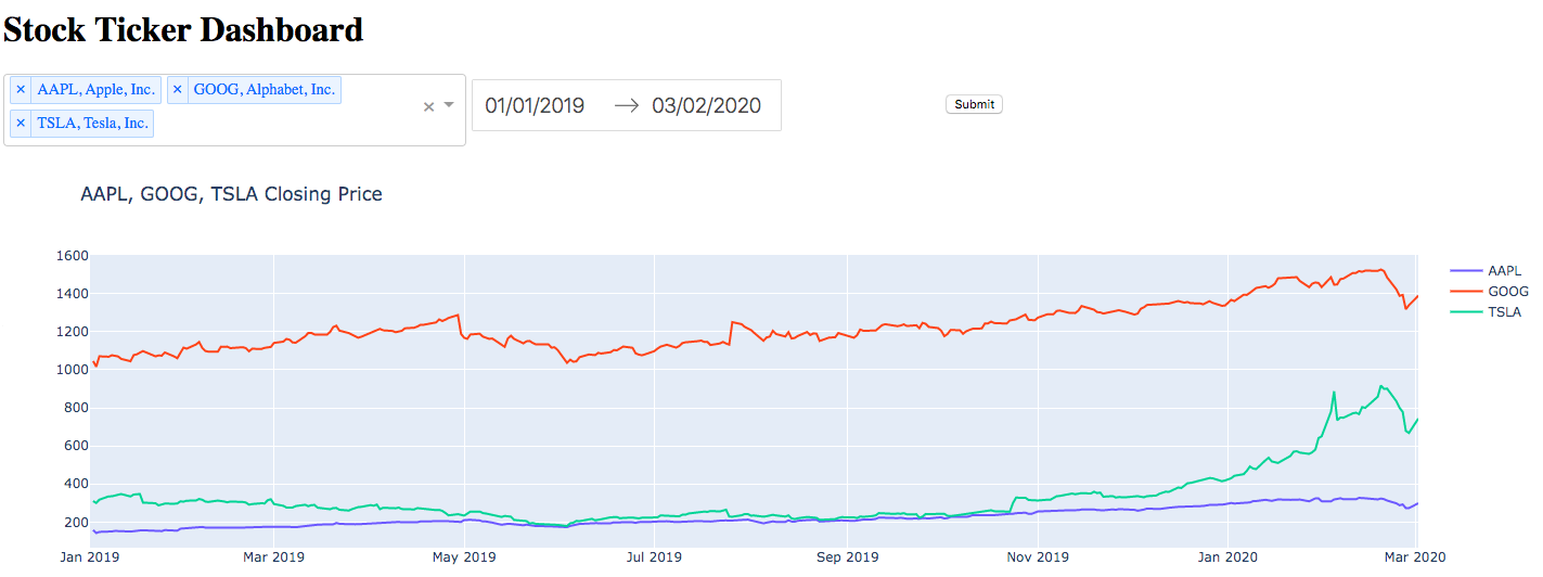
Create a dashboard that allows users to search for one or more tickers or company names, set a time period, and display the closing prices in a time series.
The graph should only update once the tickers and time period have been selected and the “Submit” button is clicked.
Features
- Search bar (possible to select more than one item)
- Calendar to set time period
- Submit button
- Line chart
Tools used
- Dash, Plotly
- Pandas
- IEX Cloud + iexfinance (Python wrapper)
Implementation
Here’s the finished prototype displaying stock prices for 3 tickers.

Layout and Styling
Each feature was embedded within a div, which were then positioned with inline CSS.
Tickers and their respective company names were both displayed in the search bar by combining the two as a key, value pair in a Python dictionary and letting it display without formatting.
Since the point of this project was to get a working prototype, I used the default calendar input for selecting time periods and a standard Plotly line chart.
app.layout = html.Div([
    html.Div([html.H1('Stock Ticker Dashboard')]
            ),
    html.Div([html.Div([dcc.Dropdown(id='ticker-dd',
                          options=[{
                           'label': name + ', ' + names.get(name),
                           'value': name} for name in names],
                           value = list(names.keys())[0],
                           multi=True
                           )],style={'display':'inline-block','width':'30%','vertical-align':'top'}),
    html.Div([dcc.DatePickerRange(id='date',
                                  min_date_allowed=dt(2000, 1, 1),
                                  max_date_allowed=dt(2020, 3, 19),
                                  initial_visible_month=dt(2019, 1, 1),
                                  start_date=dt(2020, 1, 1),
                                  end_date=dt(2020, 3, 19))],
             style={'display':'inline-block','width':'30%','padding':'5px'}),
    html.Div([html.Button('Submit', id='button', type='submit')],
             style={'display':'inline-block','width':'30%','padding':'5px'})]),
    html.Div([dcc.Graph(id='price-chart',
                       ),
    html.Div(id='output')
             ])
])
Linking the Inputs to the Visualization
Visualizations are updated in Dash using “callbacks”. These callbacks define an output div and value (the div containing the visualization and the values it should interpret), and an input div and value (such as a selection from a drop down menu).
If we want to wait until an event occurs (such as clicking a button) before updating a visualization, the event itself counts as the input and other divs/values are recorded in the callback “state”.
@app.callback(
    Output('price-chart','figure'),
    [Input('button','n_clicks')],
    [State('ticker-dd','value'),
     State('date','start_date'),
     State('date','end_date')])
Getting Stock Data on the Fly
As part of the implementation of the submit button, we first raise a PreventUpdate exception if no clicks have been recorded since inputs have changed.
As soon as a click event occurs, we iterate through each value in the search box (remember the tickers and company names were kept as a key, value pair) and grab the stock price within the dates chosen using the get_historical_value method from the iexfinance wrapper.
For each value this returns a pandas dataframe that contains the starting price, high/low price and closing price, so we just plot the closing price column on the y-axis.
We also update the graph title to show the stock name.
def update_graph(n_clicks,value,start_date,end_date):
    i = 0
    fig = go.Figure()
    if n_clicks is None:
        raise PreventUpdate
    else:
        start_date = pd.to_datetime(start_date)
        end_date = pd.to_datetime(end_date)
        for i in range(len(value)):
            df = get_historical_data(value[i], start_date, end_date, token="xxxxxxxxx", output_format='pandas')
            df.index = pd.to_datetime(df.index)
            fig.add_trace(go.Scatter(
                x = df.index,
                y = df['close'],
                mode = 'lines',
                name = value[i]
                ))

    fig.update_layout(xaxis_range=[start_date,end_date],title='{} Closing Price'.format(', '.join(value)))
    fig.show()
    return fig
Final Words
That’s it!
The design leaves a lot to be desired, but as a prototype it works fine.
The project wasn’t too challenging, but it served as some good practice for visualizing on Plotly and calling an API on the fly based on a bunch of user inputs.